
Brand refresh · Brand identity
ZAMSHU
A firmer footing for Zambeef’s footwear brand.
A refreshed identity for ZAMSHU, a division of Zambeef — a stronger mark that carries school, work and leather footwear, and ties the brand clearly to its parent company.

Why a refresh
The original logo — a sole print above a script wordmark, framed in an outlined box — had served the brand, but it looked dated and was hard to reproduce on leather, stitching and small labels.
It also didn’t clearly connect ZAMSHU to Zambeef. With the range growing across school, work and leather footwear, the brand needed one mark strong enough to carry all of it.
Before & after
Evolved,
not erased.
We kept what people already recognised — the sole print, the orange, the contained shape — and rebuilt each one to be stronger and simpler.
Before
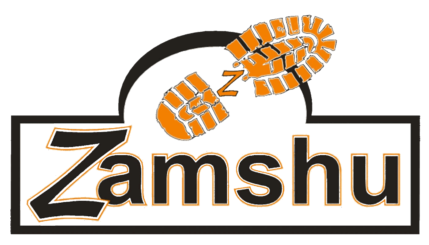
A sole print above a script wordmark in an outlined box. Recognisable, but detailed — and hard to emboss, stitch or read at small sizes.
→
After
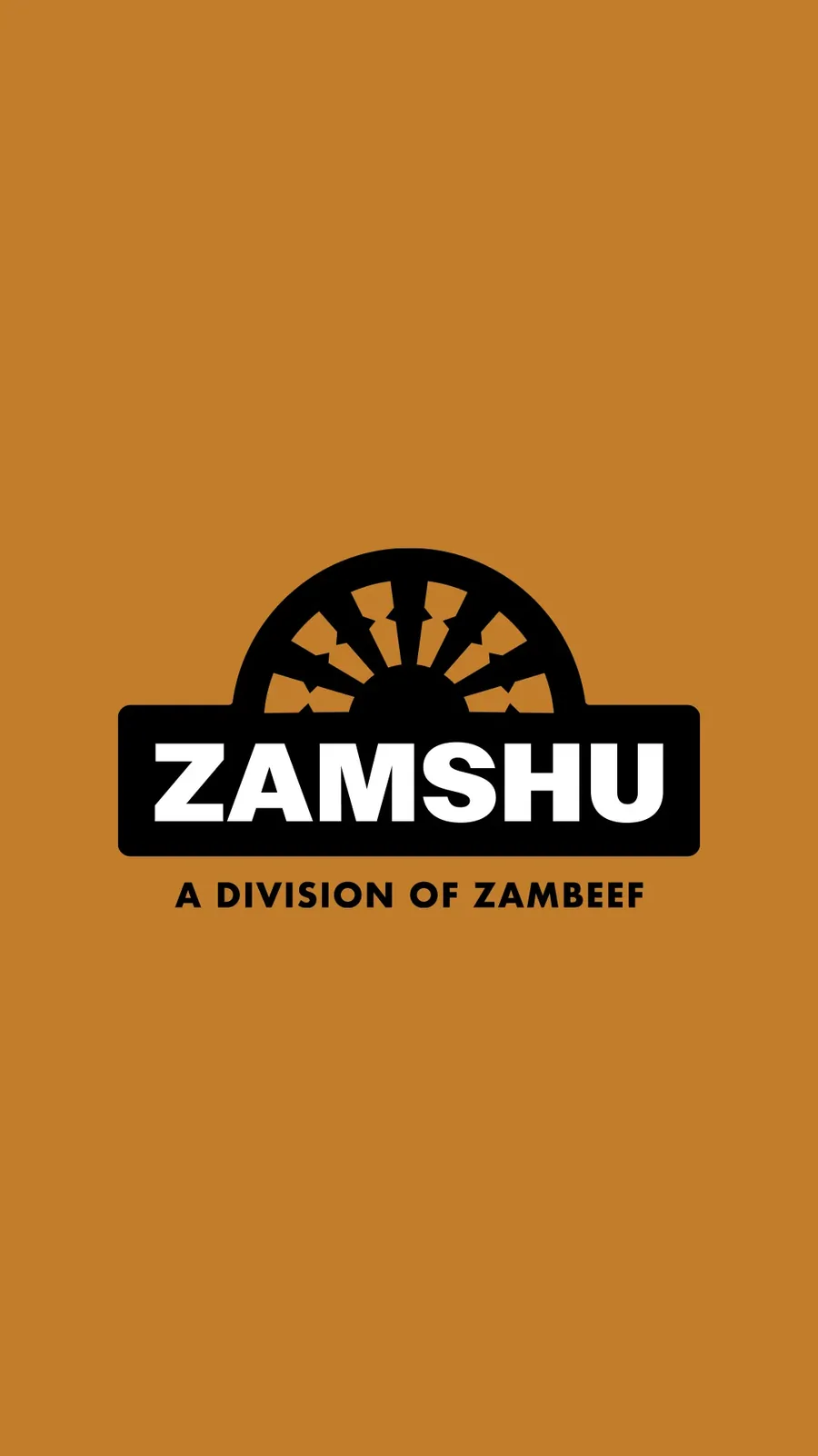
A heel tread that rises like a sun, a heavy wordmark on a solid bar, and a clear line to Zambeef.
Sole print →
Arched heel tread
Orange →
Bronze
Outlined box →
Solid name bar
Script lettering →
Heavy sans-serif
No parent link →
A division of Zambeef

The mark
Sole print.
Sunrise.
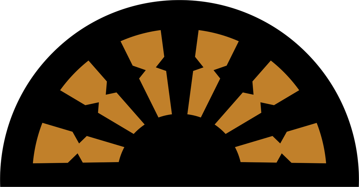
The icon works two ways: a heavy-duty boot tread, for traction and grip, and a rising sun, for a new era for Zambia.
The tread
Radiating lines echo the machinery of the mines and the tread of a safety boot — traction, made abstract.
The block
The wordmark sits reversed out of a solid bar, giving the logo the strength of a warning label for mining and industry.
The arch
Structural, like a factory roof or the entrance to a mine — a nod to Zambeef as the foundation behind the brand.
Wordmark & suite
Strong enough
to stamp.
The script gave way to a heavy sans-serif on a solid bar: sturdy like the footwear, legible at a distance and when embossed, and simple enough to stamp, deboss and print cleanly. The bar also gives the arch a base to sit on.
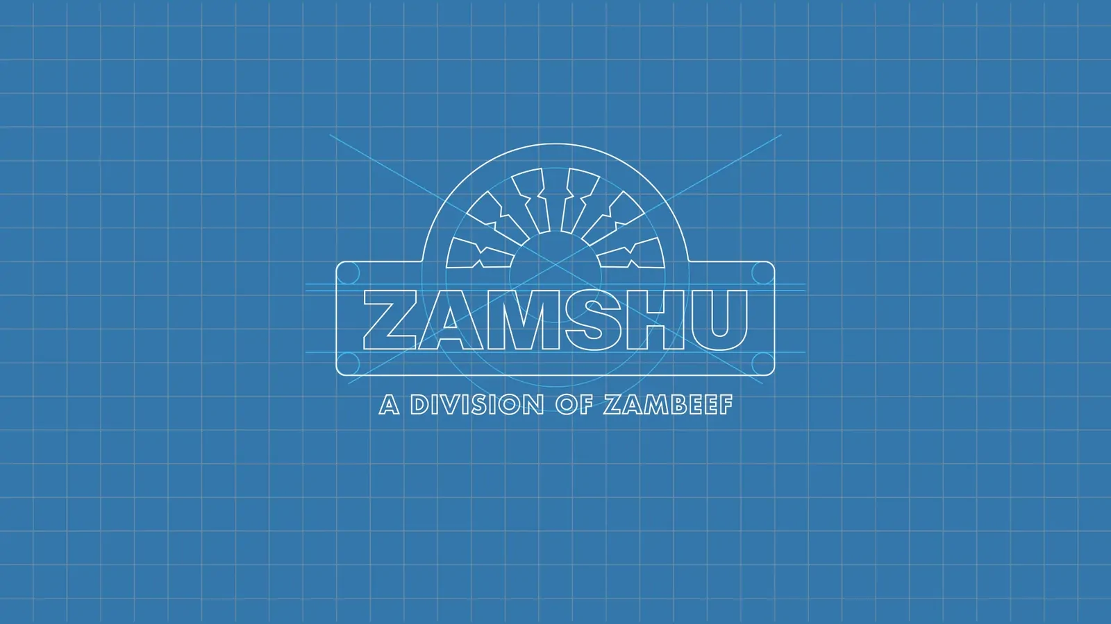
Full logo

Reversed
Without statement
Favicon
ZAMSHU — A division of Zambeef
×
ZAMSHU
Colour
Bronze anchors
every expression.
Bronze and deep walnut come from leather and finished footwear. Midnight violet grounds the darks, while vanilla custard and sky reflection soften the palette for campaigns and digital.
Bronze · Primary
#C27E2A
Deep walnut
#4E3822
Midnight violet
#2F1B25
Vanilla custard
#D7D9B1
Sky reflection
#84ACCE
Pattern
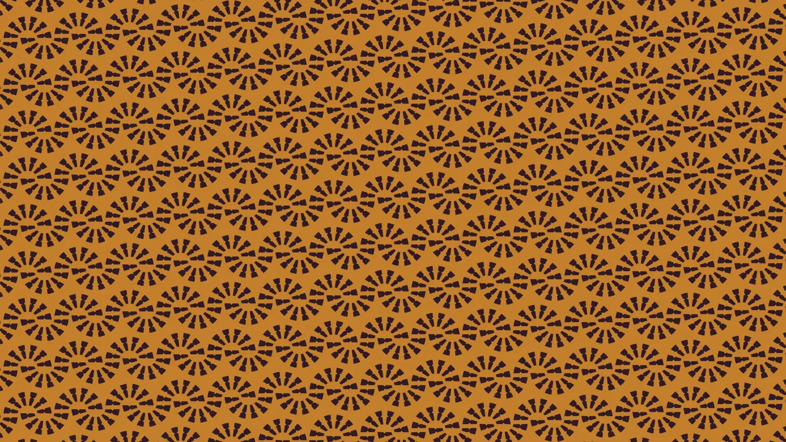
The tread,
repeated.
The rays of the mark repeat into a tread pattern — bronze on deep tones, or reversed.
Applications
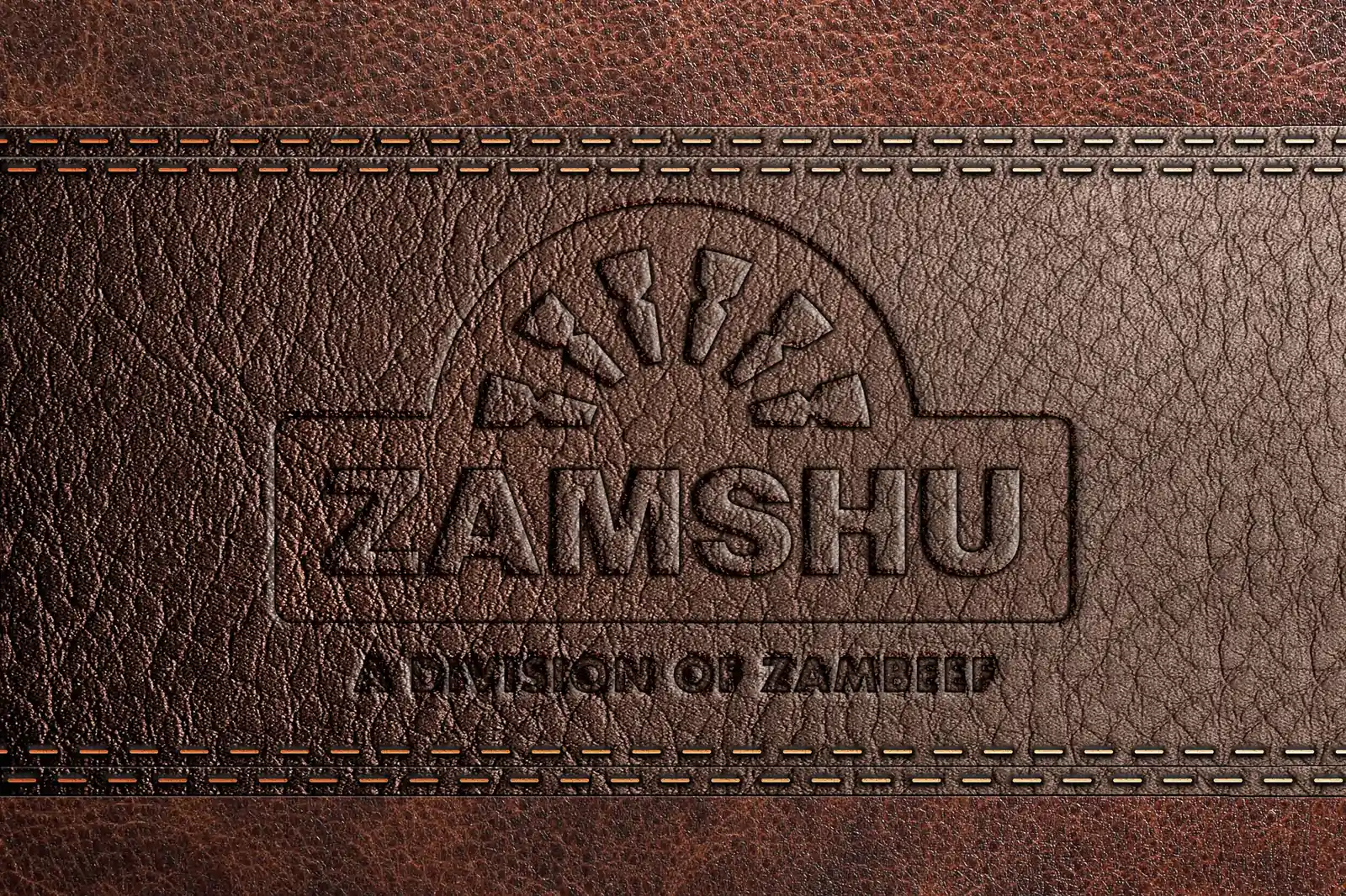
Pressed into
leather.
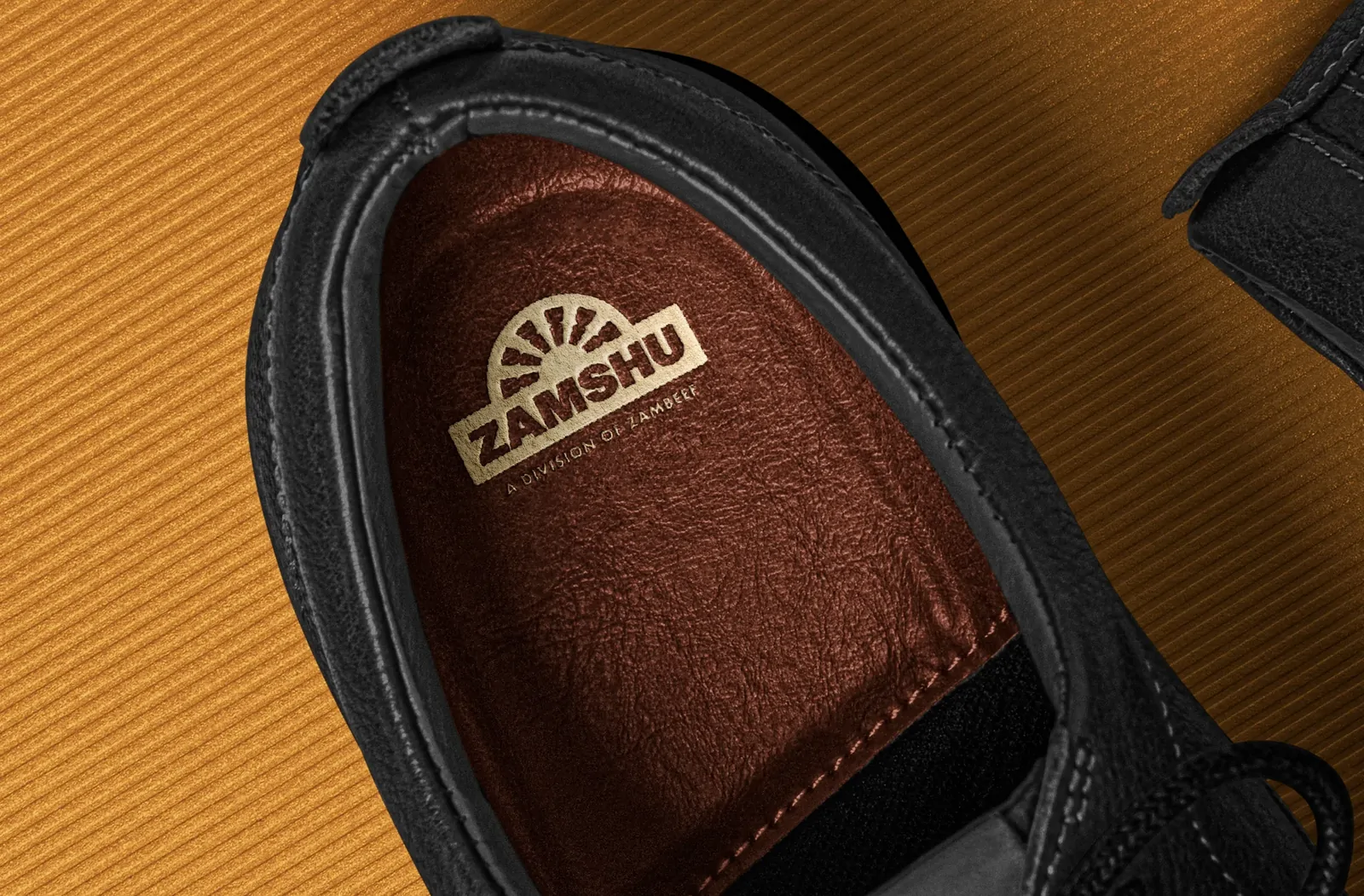
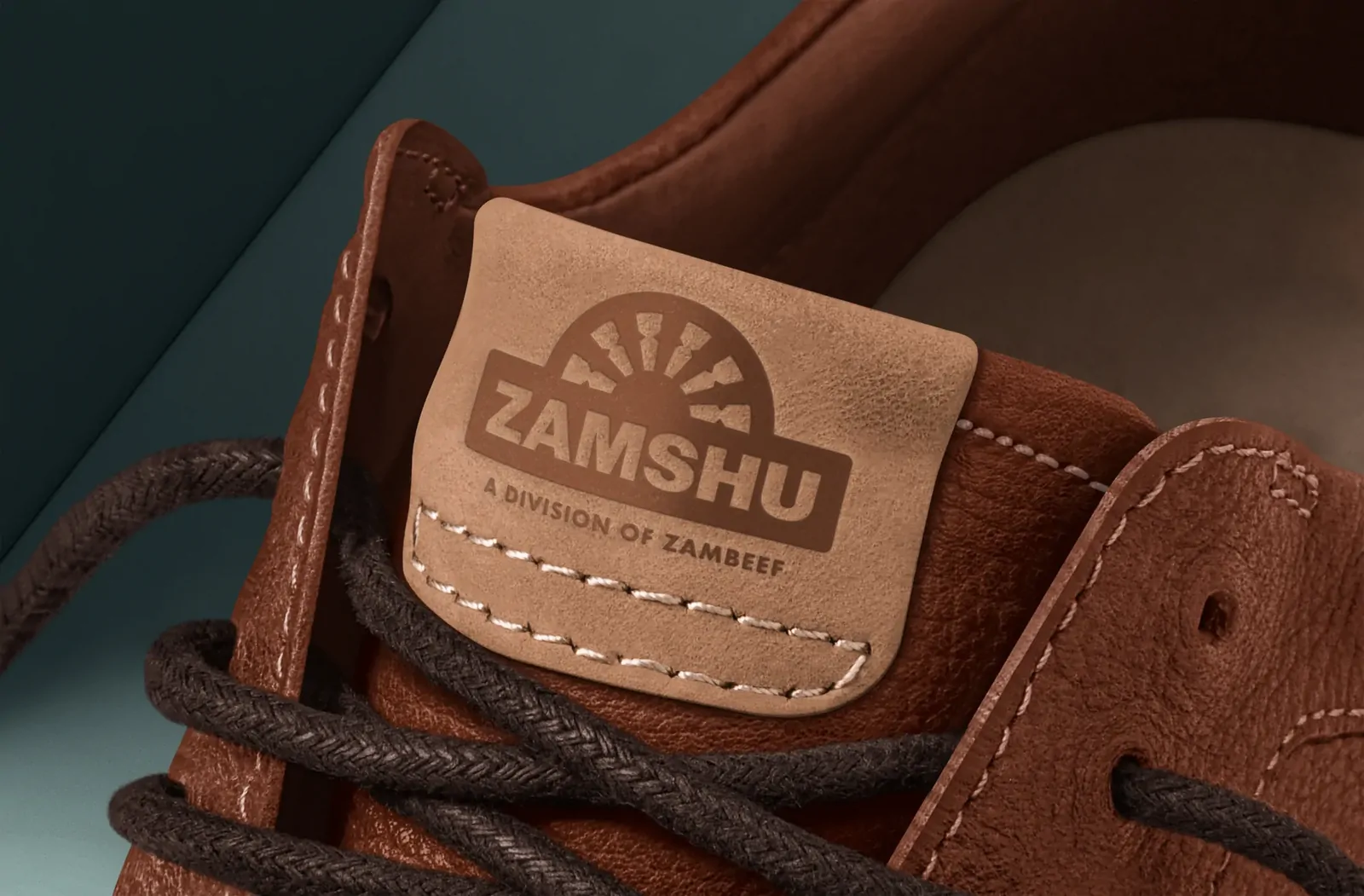
The simplified mark holds its shape when debossed into leather, printed on an insole or set on a tongue label — and stands up on its own in social content.
Concept visuals
School days.
Site days.
Concept imagery from the stylescape, showing how the identity sits across the range — from school shoes to safety boots.
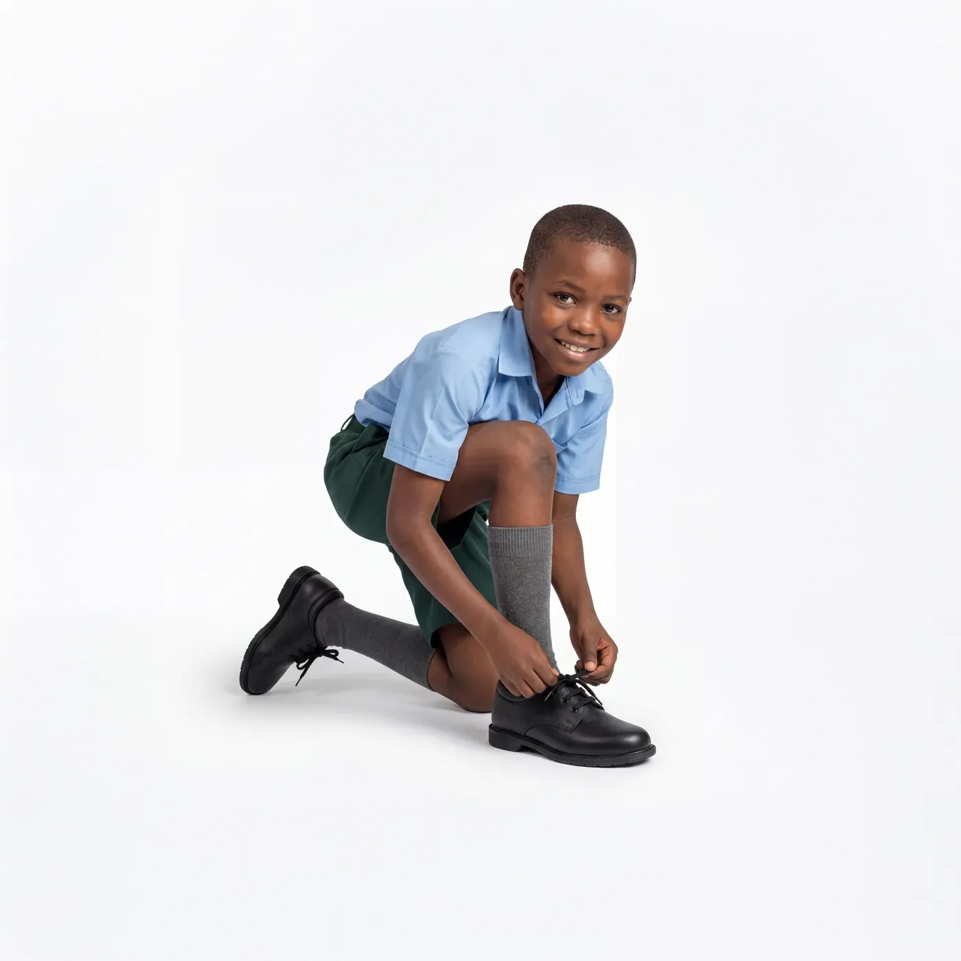
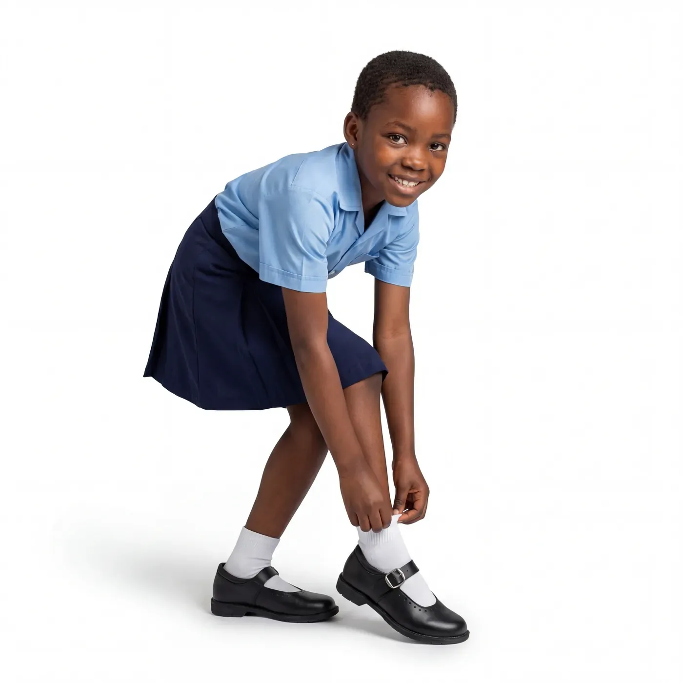

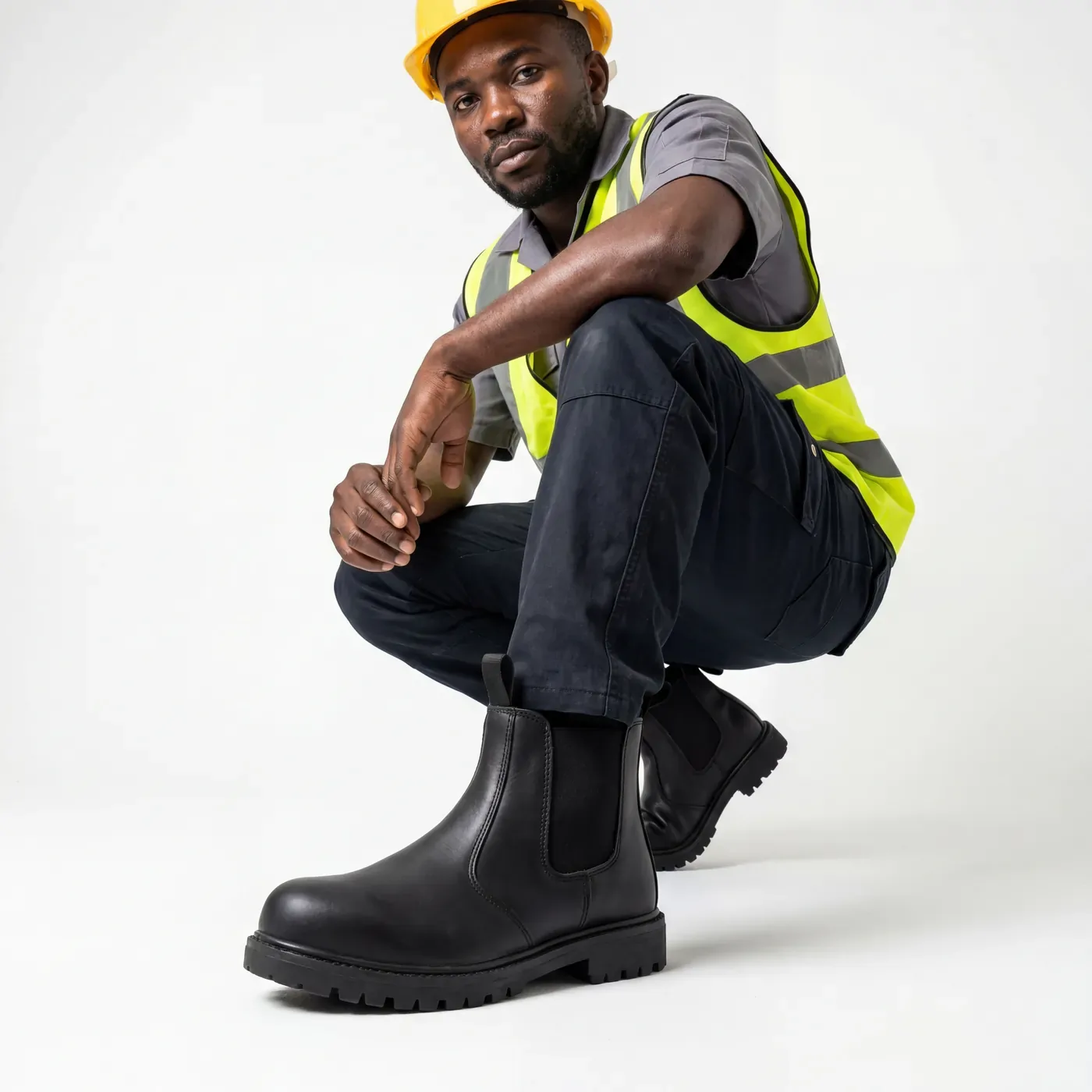
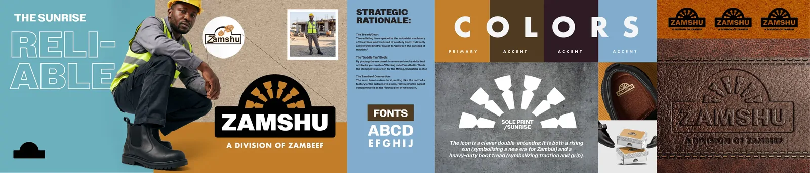
Stylescape — concept imagery, not final photography.
Credits
Creative direction
Emmanuel Mwila
Design
Ganizani Ndhlovu
Studio
Empressions Creative Works Limited
Client
ZAMSHU — a division of Zambeef